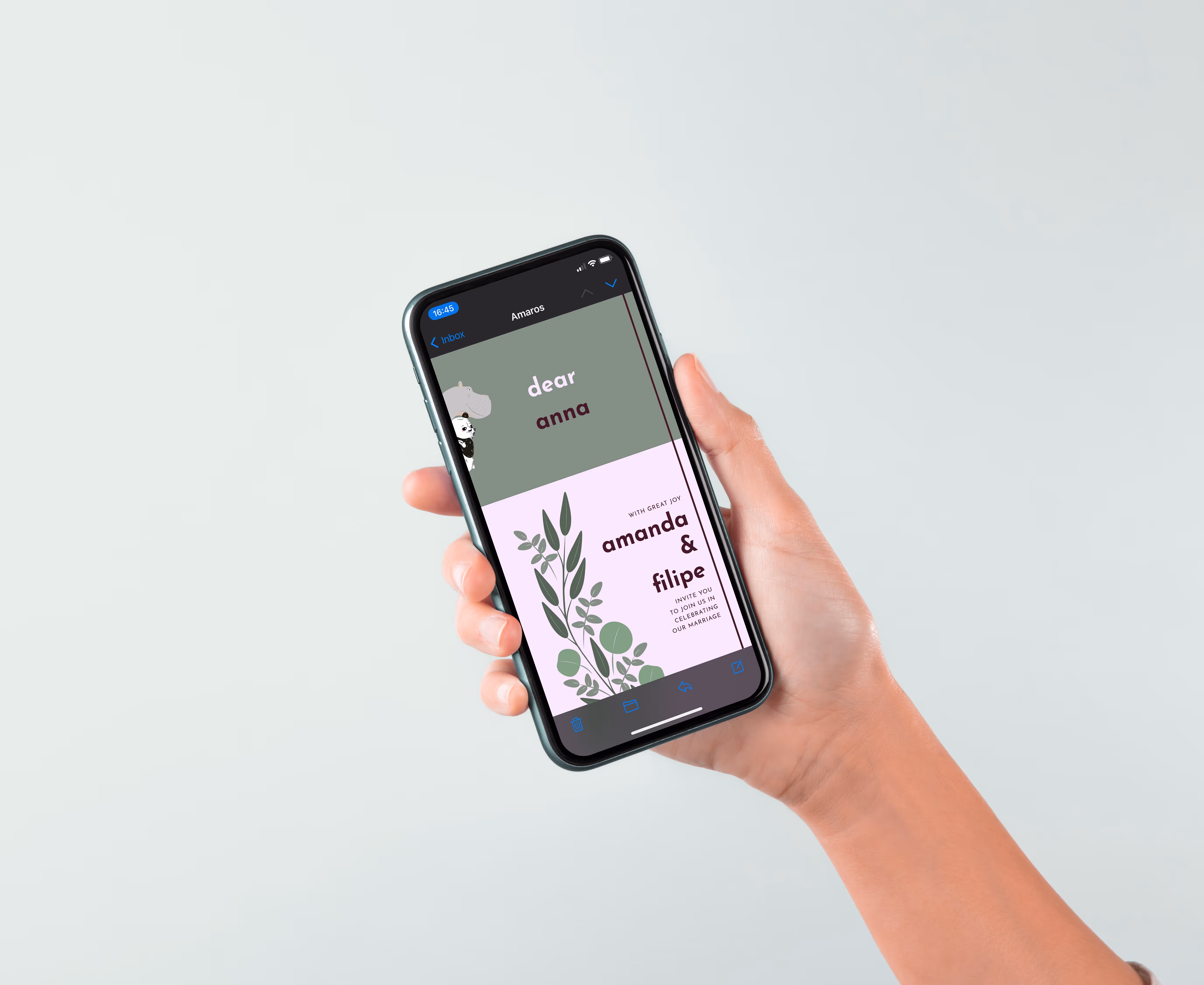
The Amaos

A cohesive wedding identity, infusing deliberate personality at all touchpoints, to create a one-of-a-kind event experience

✻ Brand Identity

✻ Website design

✻ Experience design

Scroll down for expanded case study

OVERVIEW

✻Scroll down for expanded case study✻

Challenge Context
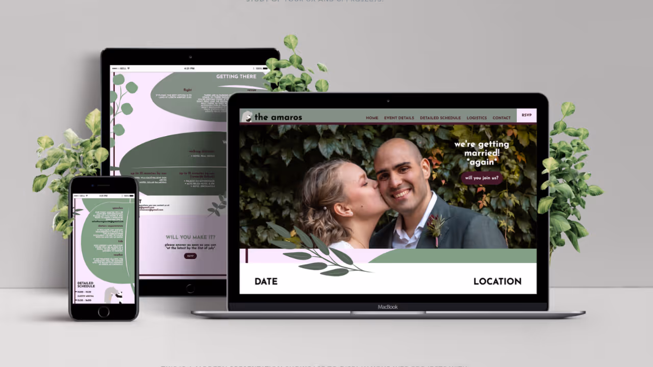
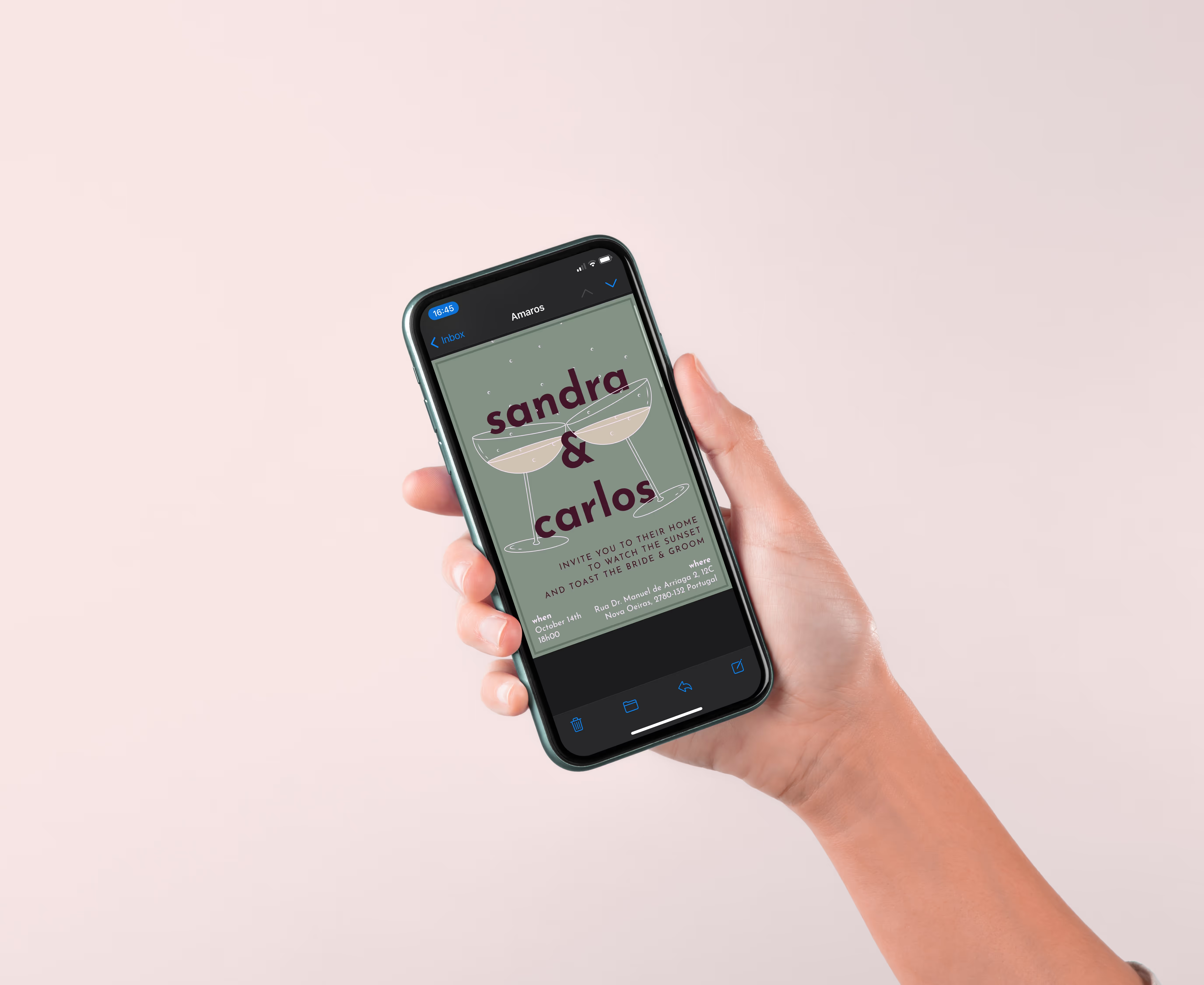
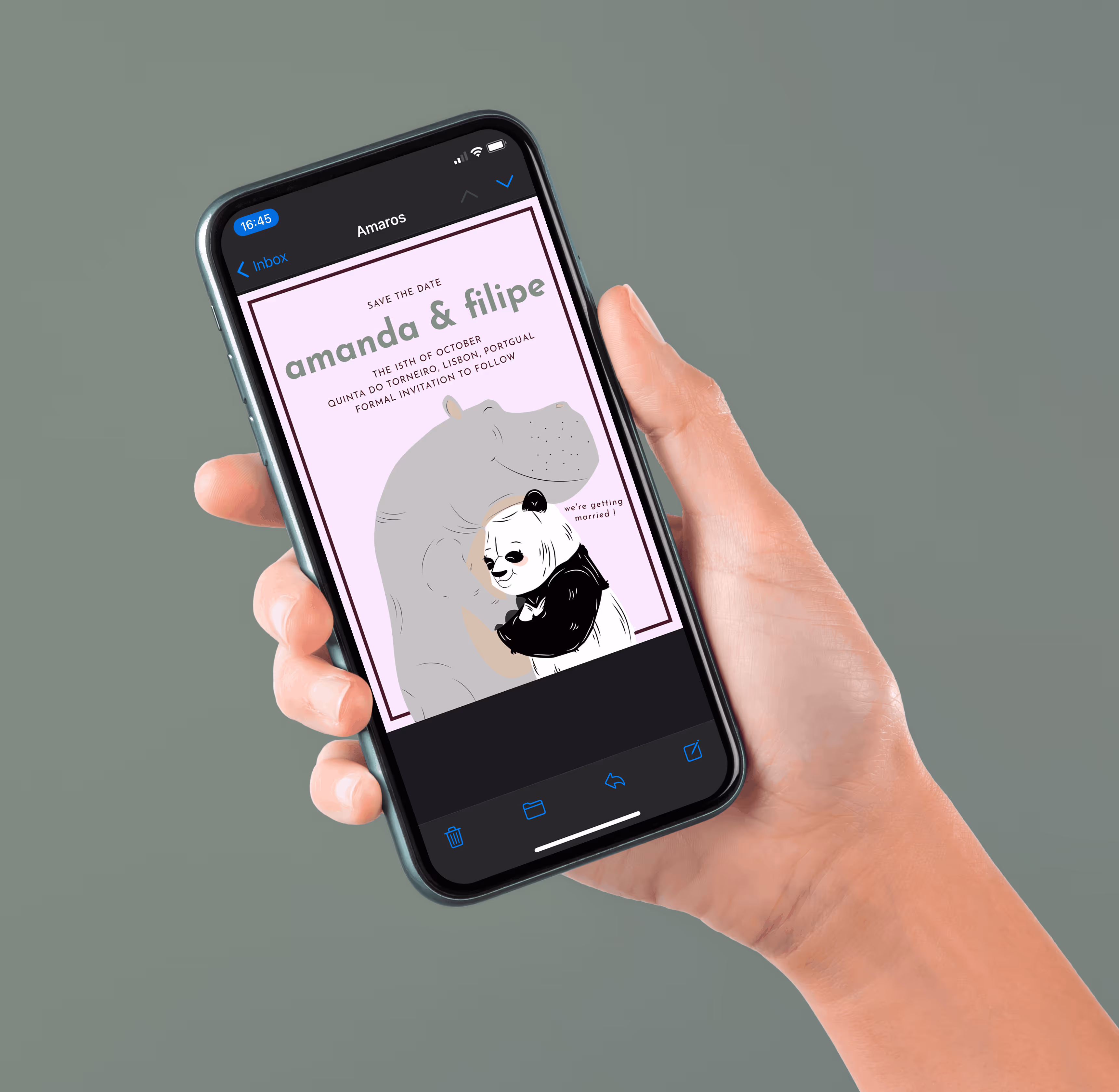
Wedding visuals often become fragmented across templates, vendors, and touchpoints. The challenge was to design and implement a unified concept that felt unmistakably personal and stayed consistent across the full set of deliverables.

Design Response
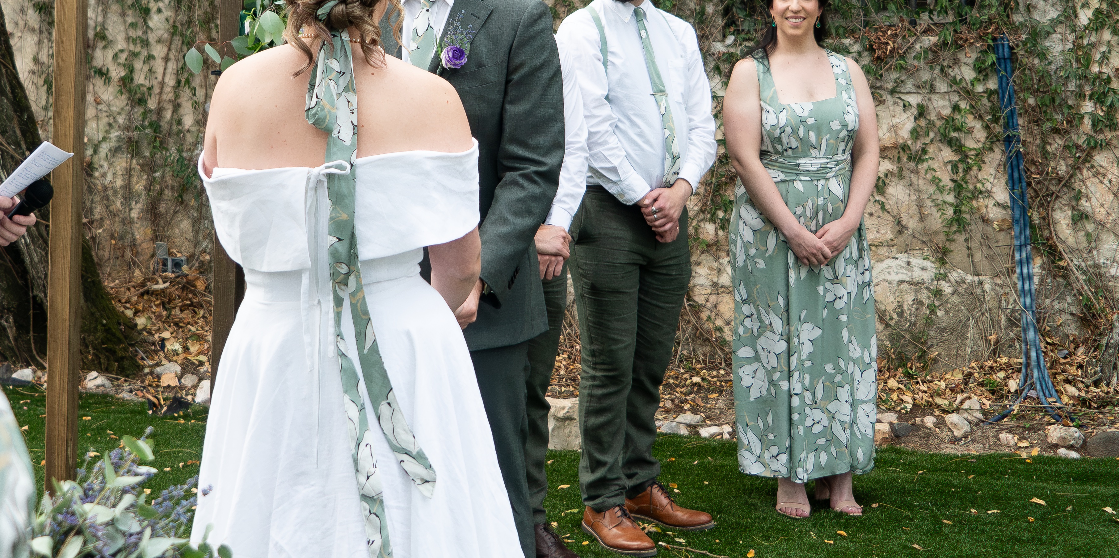
A visual identity system with clear rules for typography, colour, layout, and reusable illustration elements, applied across digital and physical touchpoints, including the website, print materials, and attire.

Design Impact
The identity system created a more cohesive and intentional overall experience where the couple's personality carried across touchpoints. By developing the concept in collaboration with the couple, it supported stronger ownership of the event and was reflected in feedback like "Really feels like us".

Contribution
Creative director and multidisciplinary designer, with an external lead programmer for website implementation. My contributions included concept development, design decisions, implementation, and garment design and production.

Key takeaways
Cross-medium work holds together when constraints are mapped early and the system rules are clear enough to reuse under deadline pressure.

Expanded

How a wedding concept like this could easily lose cohesion across touchpoints

The Amaros was a professional project that ran on and off through 2024 to 2025 in focused sprints. The brief was to design and implement a unified concept that felt unmistakably theirs, and could be applied across touchpoints without losing cohesion.

What the brief demanded from the start

The deliverables spanned physical design, print-style assets, and a live website. The main risk was fragmentation. If each deliverable is designed as a one-off, small differences in typography, colour, and layout accumulate and the overall experience starts to feel accidental.

Another risk was feasibility. Garments, print outputs, and a responsive website all have different constraints, and ideas that work in a mockup can fall apart in production. A governing structure was needed so decisions did not have to be remade repeatedly.

Why I treated the project as a system instead of a set of separate deliverables

I treated the project as a visual identity system rather than a collection of outputs. The system was defined first, then deliverables were created inside it. That reduced re-decisions and made it easier to keep consistency across formats.

This also shaped collaboration. I built the website skeleton and started the programming. An external developer improved functionality, ensured plugins worked reliably, handled hosting, and led GitLab. After that, I made final design adjustments so the implemented site matched the intended design closely.

A visual identity carried consistently across digital, print, and physical design

The identity was expressed across both digital and physical outputs:

- A consistent visual language through typography, colour, layout rules, and reusable illustration elements

- Digital invitations including Save the Date, Wedding, and Cocktail Hour

- A wedding website serving as the digital anchor

- Printed materials such as menus, place cards, programmes, and a bingo card

- Physical design elements aligned with the theme, including the wedding dress, bridesmaids' dresses, and groom and bridal party ties that I designed and produced

What production and implementation required to keep the experience coherent

The work was delivered through coordinated sprints. Concept and design decisions were developed in collaboration with the couple, then outputs were produced in stages based on deadlines. Website build and other touchpoints were developed in parallel, with refinement after implementation to keep the system consistent.

What the project clarified about designing across formats without losing the core idea

This project reinforced that cohesion comes from governance. When constraints and deliverables are mapped early, and system rules are clear, a multi-touchpoint experience stays consistent even as production constraints and timelines shift.

Say Hi! And get the conversation going!

Thanks for the message! I'll get back to you soon!
Oops! Something went wrong while submitting the form.