The problem
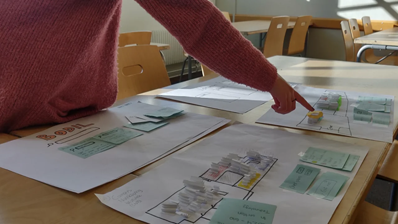
Students at Campus Norrköping library weren't struggling to find books in the catalogue. The problem showed up afterwards, when they tried to translate what they'd found into a physical location.
The 2D map was hard to read, the Dewey Decimal System gave no intuitive sense of where anything was, and the physical signage didn't connect to either. So the breakdown wasn't in the search, it was in the space between the screen and the shelf.
The existing journey
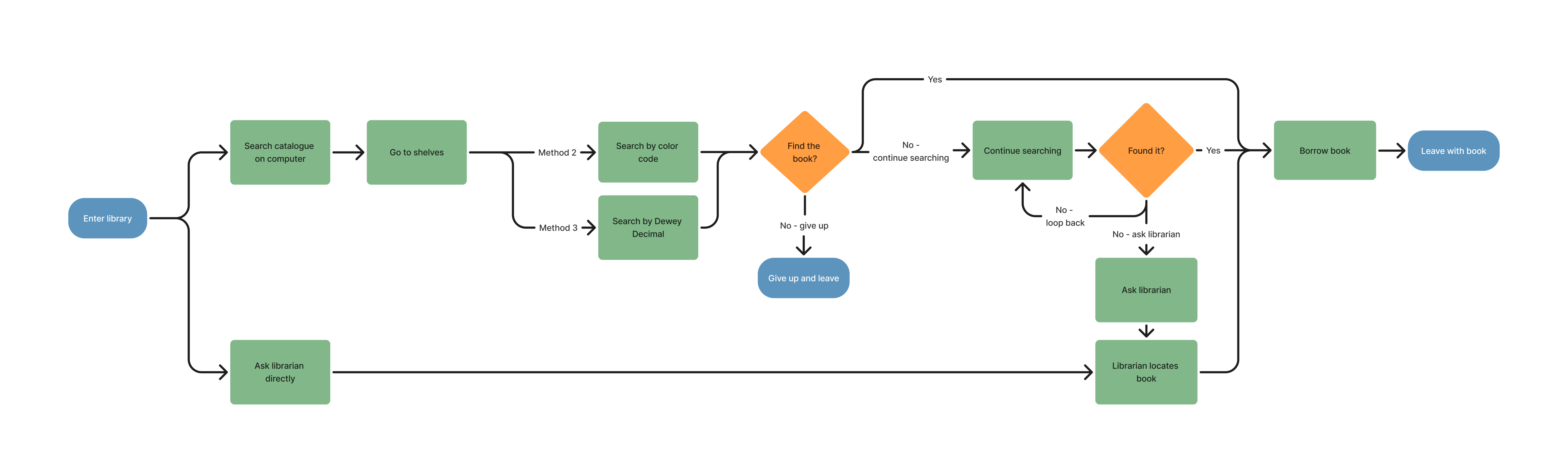
Where the journey breaks down between catalogue and shelf
The design
Bodil is a colour-coded, symbol-supported wayfinding system designed to work across every step of the journey from search to shelf.
3D interactive digital map
A spatial map of the library, designed to reduce the cognitive effort of translating a catalogue result into a physical location. Users can orient themselves and trace a route before they leave the catalogue.
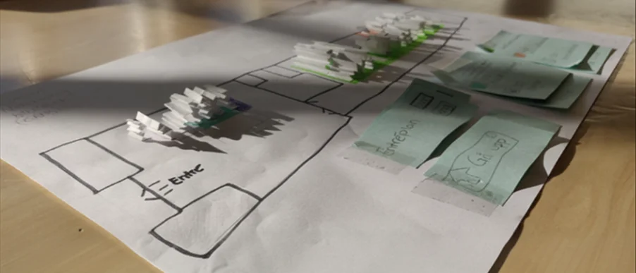
3D map prototype

Screen tower lo-fi
NFC login
Allows users to pull up a personal profile and navigate directly to books on their saved list, removing the need to remember a shelf location between the catalogue and the stacks.
In-library screen towers
Placed at key decision points in the physical space, reinforcing orientation and giving users a reference point once they're moving through the library.
Colour-blocked shelf sections
Each subject area is assigned a colour and a symbol, making it possible to identify the right section from a distance and confirm it up close.
Floor arrow guides and rotated shelf signs
Physical navigation cues that carry the system from the screen into the stacks, using the same colour and symbol language throughout.
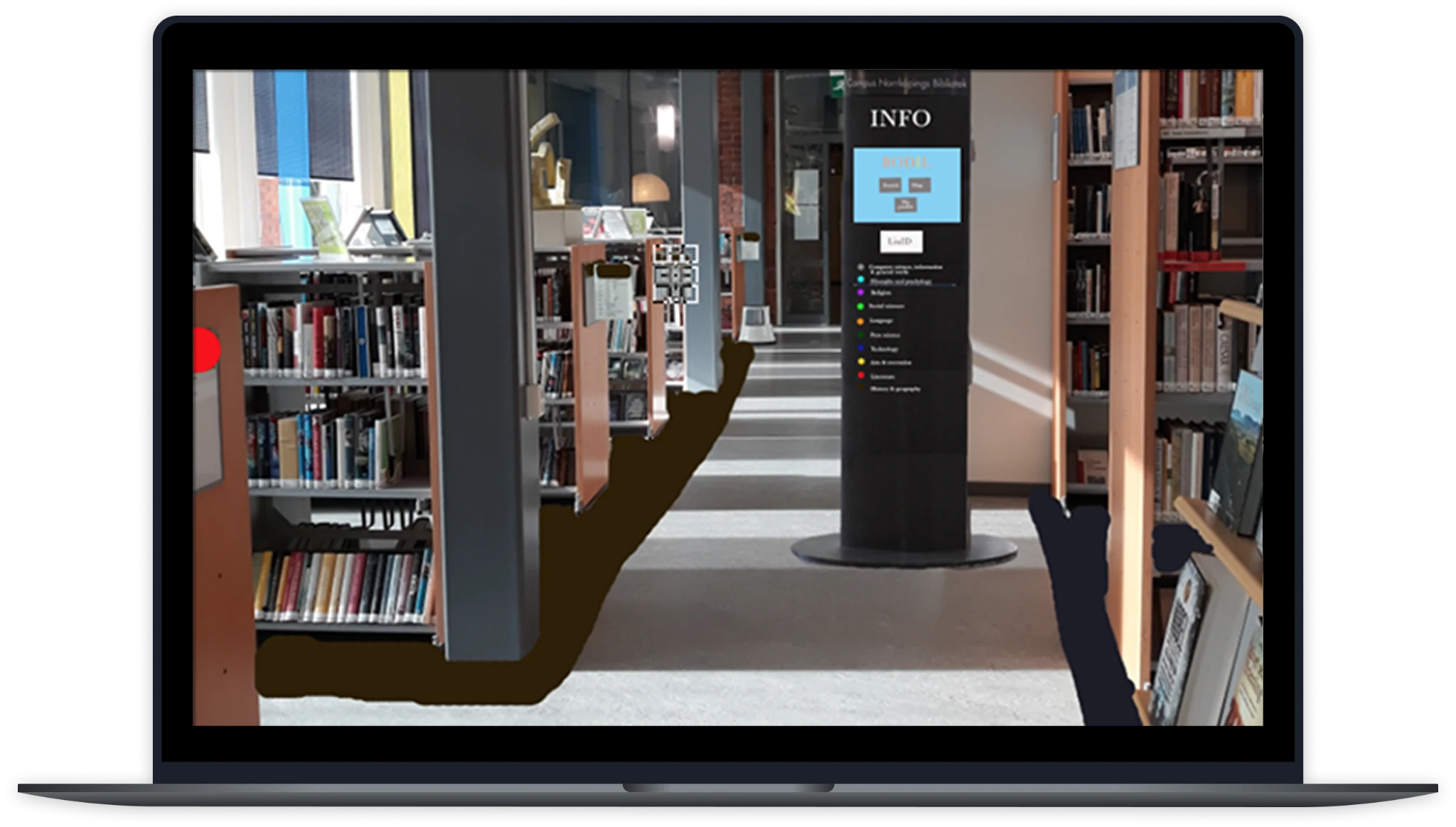
Visualized in the library
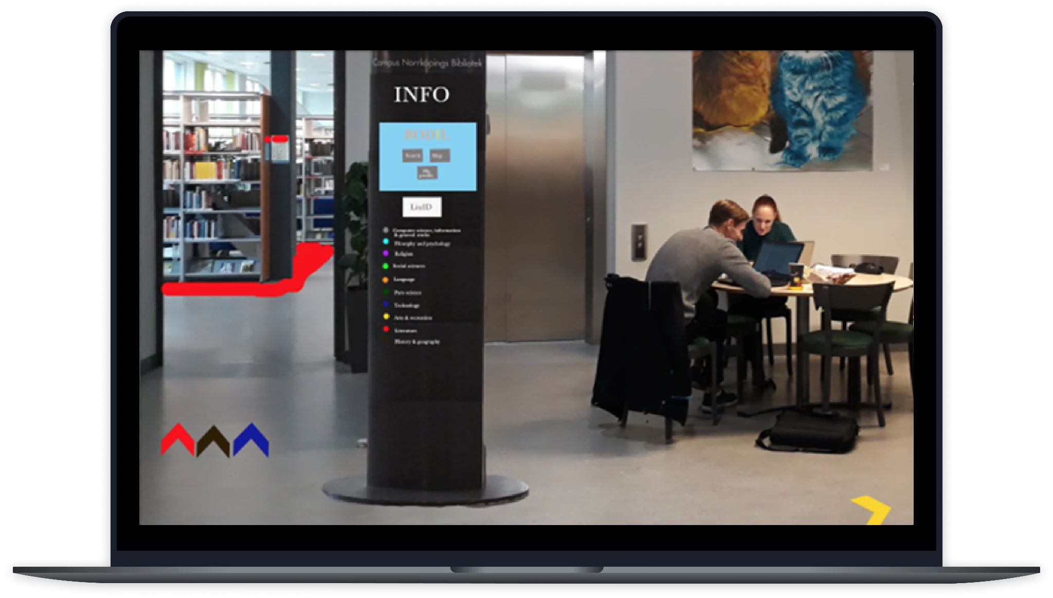
In-library navigation cues
The redesigned journey
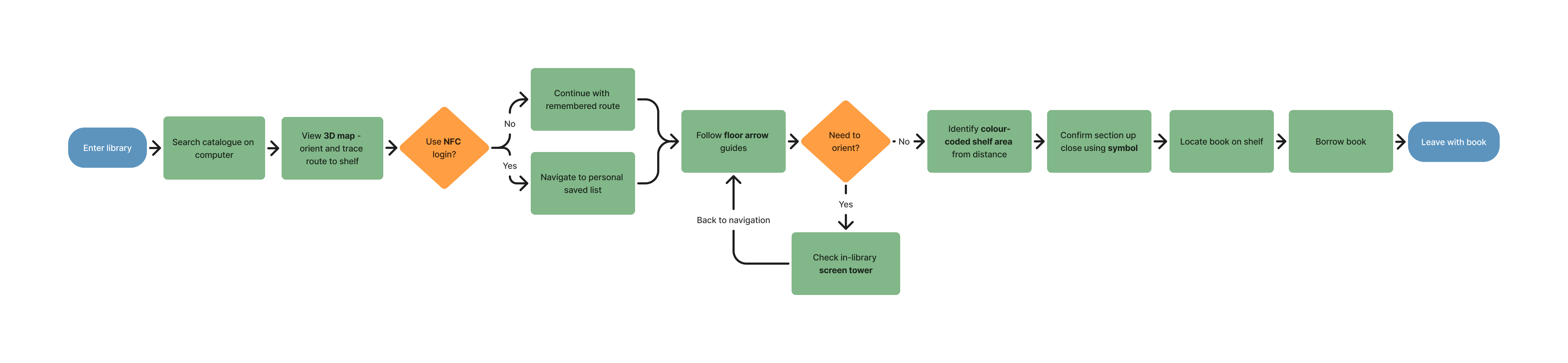
How Bodil bridges the gap between catalogue and shelf
The decisions
Information structure system over AI or AR
Three directions were on the table: a colour-coded information system, an AI-guided robot, and an AR overlay. The robot was rejected because of cost and the risk of changing the atmosphere of the library, which users valued. AR was rejected because it excluded users without smartphones and required technical literacy that conflicted with the inclusion goals of the project. The information structure system worked within existing infrastructure and served all users equally.
3D map over 2D
The existing 2D map was one of the identified failure points. A 3D representation was chosen to reduce the cognitive load of mapping a flat diagram onto a three-dimensional space, which is exactly where users were getting lost. The 3D format more closely mirrors how people actually experience and navigate a physical environment.
Symbols paired with every colour code
Colour alone is not a reliable navigation signal. Red-green colour blindness affects roughly 8% of men, so every colour in the system is paired with a distinct symbol. This also makes the system more robust for users in low-light conditions or at a distance.

Colour and symbol grid for all 10 Dewey categories. Externally sourced reference, not an original design.
Built on existing hardware
New infrastructure was rejected where existing hardware could carry the system. This kept the concept realistic within the library's constraints and avoided unnecessary resource use, which was explicitly documented as a sustainability rationale in the project report.
No persistent user data
Saving personal browsing data was considered and rejected. It introduced privacy concerns and required additional digital infrastructure for no meaningful gain in usability, so the NFC login surfaces a temporary session only and does not store or track behaviour.
The results
The prototype was tested with 5 participants using think-aloud protocol, task completion tracking, and the PSSUQ questionnaire.
The point
Wayfinding feels like a spatial problem, but the real issue here was informational: a disconnect between two systems, digital and physical, that wasn't designed well enough to speak to each other. What I found most interesting was that the right response wasn't a smarter piece of technology but a more coherent system built on what was already there. That's something I've carried forward, that understanding where something breaks is usually more useful than jumping straight to what should replace it.