The problem
Borrowing clothes between people already happens informally, but no dedicated app was doing it at scale. So the starting point was understanding what it would actually take for something like that to work, and whether a well-designed app could make sharing between friends and strangers feel trustworthy and convenient enough that people would actually come back to it.
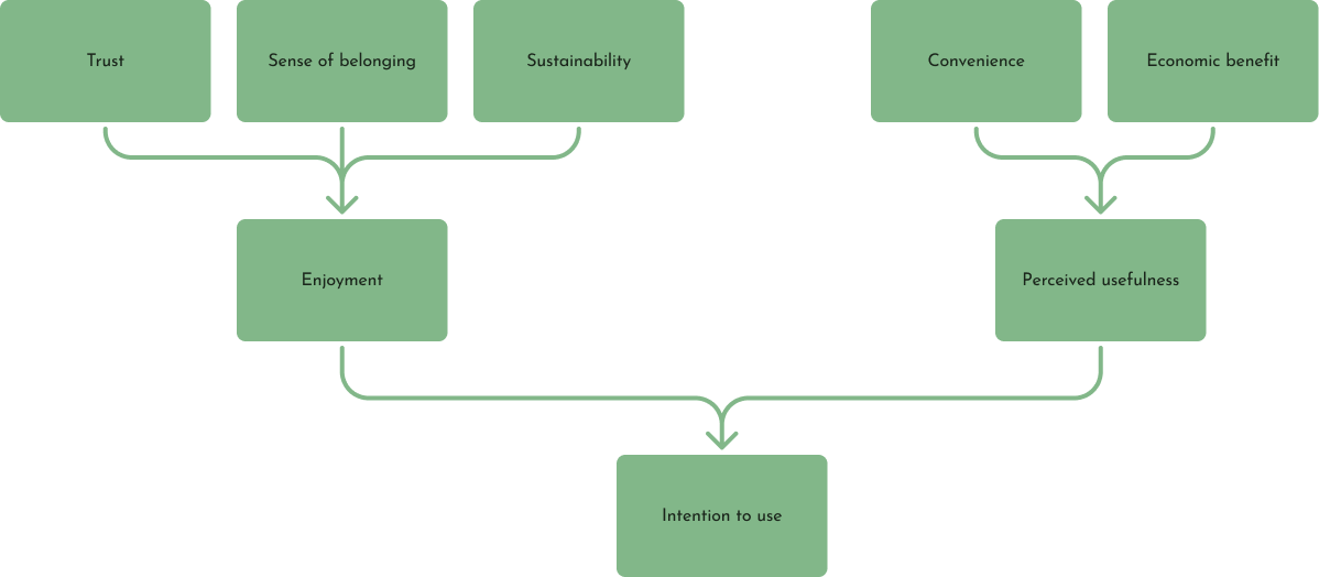
Motivations and barriers across the borrowing journey, the starting point for the design
The design
A 25-screen hi-fi prototype covering the full borrowing experience across five core sections.
Browsing
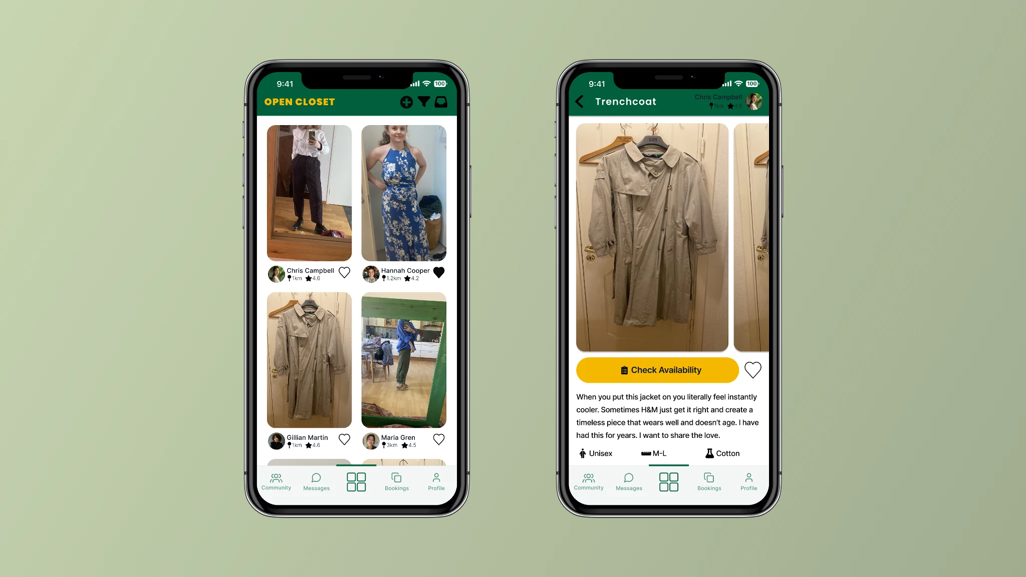
A feed-style layout for discovering items available to borrow, built on a familiar shopping-app structure so the interaction feels recognisable from the start. Each item links through to a product detail page with availability, item information, and enough social context to support trust before a request is made.
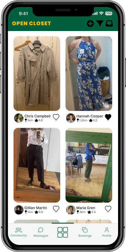
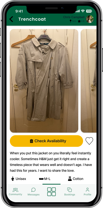
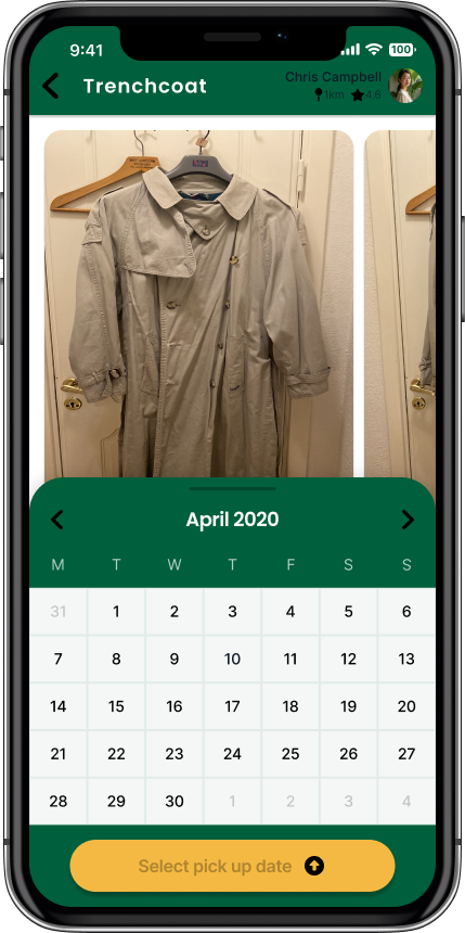
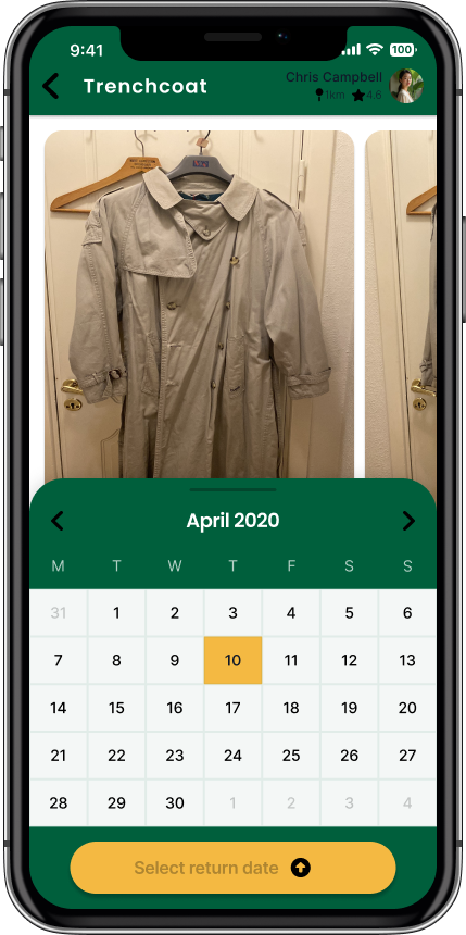
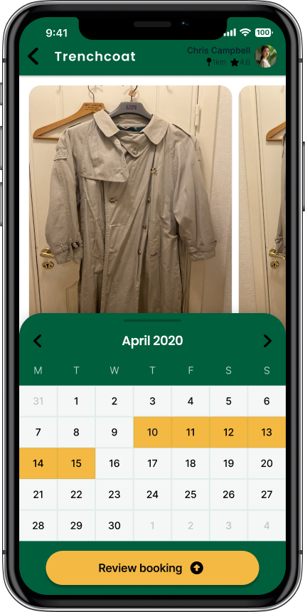
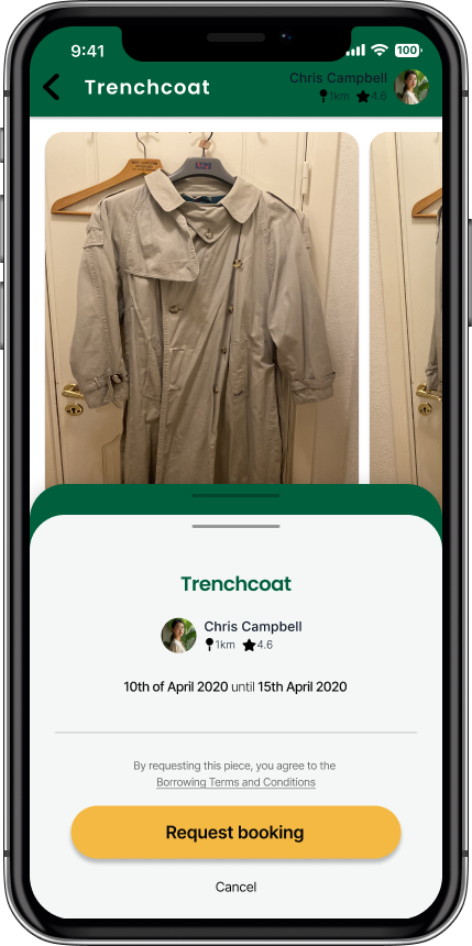
Browse feed, expanded item view, and the product detail page across four scroll states showing availability, item description, owner context, and the request flow.
Booking
Split into three states — active, upcoming, and history — with in and out arrows distinguishing lending from borrowing, so it's always clear which side of an exchange you're on without having to think about it.
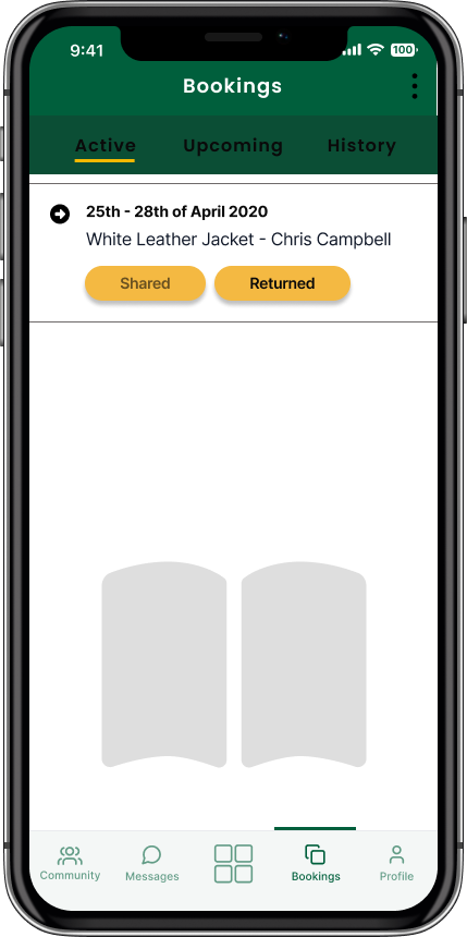
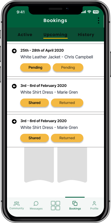
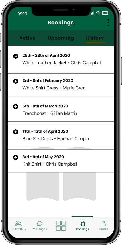
Three booking states with directional arrows distinguishing lending from borrowing at a glance.
Community
Two views: all members and friends only. All members supports finding new people to share with, friends only keeps things within a trusted circle, so users can move between discovery and comfort depending on where they are with the app.
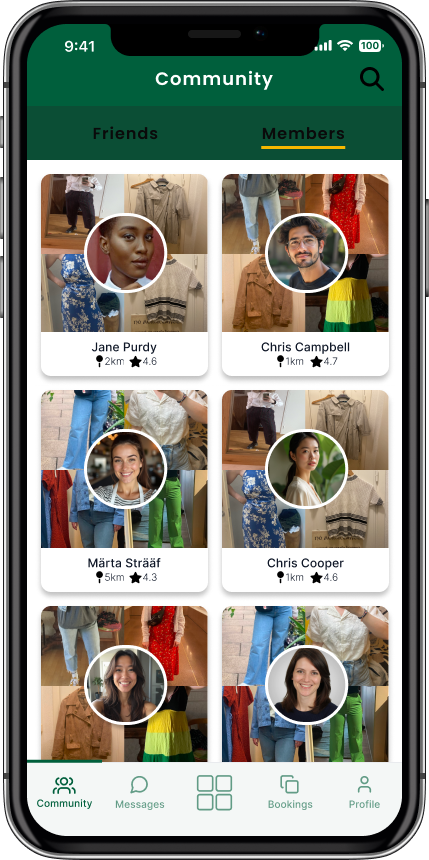
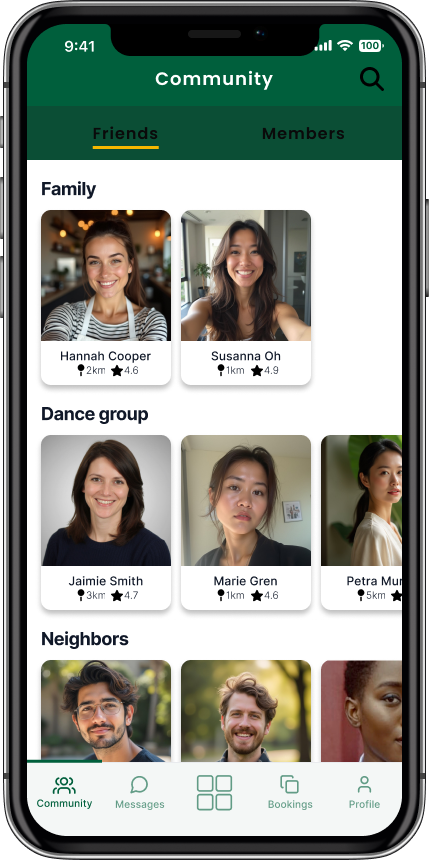
All members and friends-only views, for discovery or sharing within a trusted circle.
Messaging
Direct communication between borrower and lender for coordinating logistics and building familiarity around a loan.
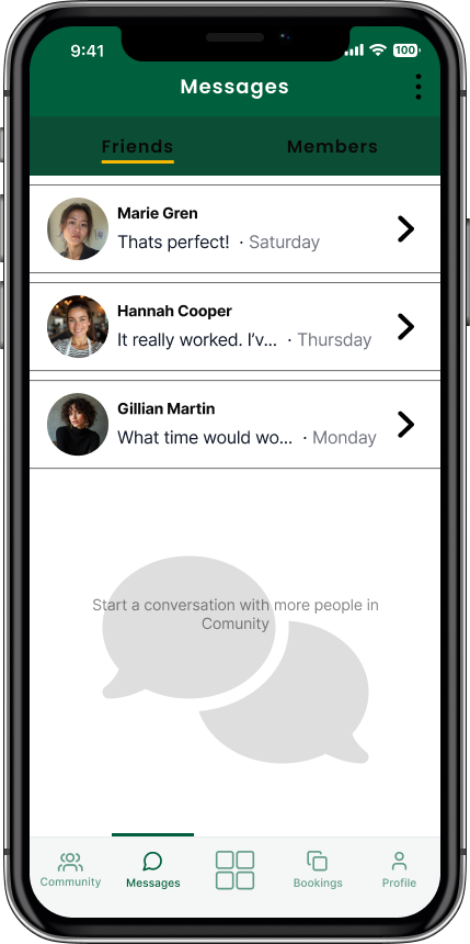
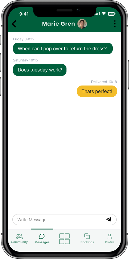
Direct messaging between borrower and lender for coordinating logistics and building familiarity.
Profile
Personal description, uploaded clothes available to lend, and items favourited from other users.
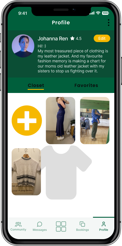
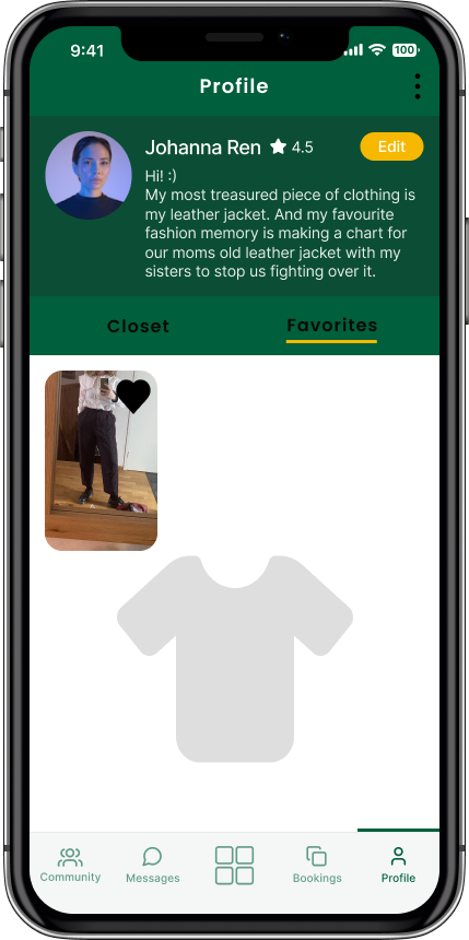
Closet and favourites tabs: clothes available to lend and items favourited from other users.
The decisions
Familiar shopping-app mental model as the base structure
The borrowing concept was unfamiliar enough that introducing a completely new interaction pattern at the same time would have made it harder to get started. Using a recognisable structure for browsing and product detail meant users could focus on the new behaviour — borrowing from someone they don't know — rather than also having to learn a new interface.
Booking split into three states with directional arrows
A single bookings view would have been ambiguous for an app where every user is simultaneously a potential borrower and lender. Splitting into active, upcoming, and history, with arrows indicating direction, resolved the coordination complexity of a two-directional exchange so it's always clear which side you're on without having to think about it.
Community page with two views
A single community view would have forced a choice between discovery and comfort. All members supports finding new people to share with, friends only keeps things within a trusted circle. Keeping both meant the app could serve users at different stages of trust without pushing them toward one model.
Ecological and economic benefit messaging left implicit
Explicit green and economic framing was considered and set aside. Instead, green was used to subtly signal economic benefit and mustard yellow to signal enjoyment, letting users bring their own interpretation rather than being told why they should care.
The results
Tested with 5 participants using think-aloud protocol, task success tracking, SUS questionnaire, Usability Expectation Measure, and thematic follow-up interviews.
Themes
- Convenience mattered more than expectedParticipants valued the filter and search functions specifically because they made the app feel more practical than browsing second-hand stores.
- Trust was the strongest unresolved findingThe interface supported it, but participants wanted clearer rules, stronger accountability beyond ratings, a documented process for damage or non-return, and opportunities for face-to-face interaction before lending to strangers.
- Belonging came up across multiple participantsRepeated sharing with the same members was seen as a natural way to build new friendships or strengthen existing ones.
The point
The usability results were good, but the most interesting finding was what they revealed about the limits of interface design. The interface could support trust, but it couldn't resolve it alone. Rules, accountability, a clear process for damage or non-return, and chances to build familiarity before lending to a stranger were part of the service itself, not something UI refinement alone could solve. I think knowing where the design problem ends and where a different kind of problem begins is as important as getting the design itself right.